

16 February 2012
15 February 2012

14 February 2012

01 February 2012
...sign language
Along came the bus. I got on.

My bus journeys are currently being expedited by Deyan Sudjic's The Language of Things, a remarkably digestible read on the objects around us, the design behind them and together, what it all means. Unless Deyan suddenly turns it into an erotic crime thriller, I'd recommend it to anyone, including nanas - with a revealing eye and easy turn of phrase it reflects upon not just design but social issues which I imagine very few avoid brushing against in this flipping complicated world which we live. Discussed are some everyday objects around us and how their carefully considered shapes, forms and functions have made them the archetypes we're familiar with - even when in their most modern form they bear little visual relation to their predecessor. Take for example the first Bakelite telephone, designed by Jean Heiberg, with its silver dial and distinct ergonomic handset. Although pretty much out of popular use today, the pictogram to which it's associated is still an internationally recognisable symbol for telephone (for how long is arguable, given a generation of kids will never likely use or let alone see the Bakelite telephone for a reference point). However, although stuff gets superseded, when the item in question creates a culturally significant mark it does so in a collective conscience. This 'old fashioned' phone is hard to forget even after being upgraded and turned to scrap. Sure, there were other telephones before this particular model, but Heiberg's design hit the mark which elevated it to live on as a popular visual metaphor for telephonic communication.
Another example is the Deiter Rams calculator. Designed to be the most perfect form of this particular mathematical instrument it was purposely shorn of ornament and crafted to ascend such transient things as fashion. Rams' goal to ultimately remove any need for another calculator. As a result, this timeless object inadvertently formed an archetypal idea of what a calculator should be. So much so that Apple's own iPhone calculator bears an uncanny resemblance by using Rams' original calculator as inspiration for their skeuomorphic user interface. It's a neat little nod by Apple towards Rams' original mould-breaking one-calculator-to-rule-them-all rationale, picking up the baton to set a new category of device in the form of the iPhone; one-device-to-rule-them-all. But what becomes of archetypes such as the telephone and calculator now that many familiar, singular objects are being rolled into one clever little smartphone? This brings me back to the iPhone icon on the bus stop poster.
So archetypes remain. As part of a visual vocabulary, they are the building blocks of how we understand symbols, which in turn exist to represent something in the simplest form, to communicate meaning. On their own terms, symbols can be understood because of the leg work put in by archetypes, but they can also be subverted, and it's a powerful tool the designer has at his or her disposal. Indulge me in a ridiculous macho simile if you will, but if symbols are bullets, context is a gun.


What on earth am I trying to say? I'm not sure. I've been writing this on and off for God only knows how long, tangled myself in many iterations of many strands of thought on the subject of signs, their symbols, the archetypes from which they are born, and the power they behold in both the right and wrong hands, but still I'm having trouble wrapping this all up. So let's try.
The generic smartphone has become part of the fabric of modern life, but it's Apple's aesthetically pleasing user-friendly iPhone which has forged a new archetype and symbolic benchmark into which all other same-category devices fall, further informing our semiotic understanding of them. All through design magic. And marketing. And vertically integrated lock-in business models. But that's another conversation altogether.
Semiotics. It's complicated. Yet simple. Yet complicated. And I've done nothing here to help matters. I'm sorry.
In a nutshell. DO read The Language of Things - even the most seasoned designer will enjoy the crystallisation of ideas when Sudjic eloquently shares his. DO also read Roland Barthes Mythologies as a companion piece. DO NOT ever use a pictogram of a burger as a political statement. DO NOT tell anyone I used the bullet and gun metaphor. DO remember to come back and visit, it can get so lonely out here on the internet.
Rainforest pic © Roberto Saccon
20 January 2012
...business cards good enough to eat
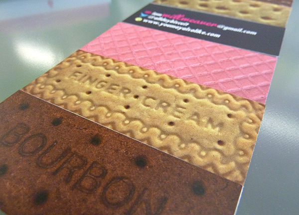
I'd been meaning to do this for aaaaaages and I finally got round to it - make some Moo MiniCards based upon one of my very favourite things; biscuits. You're no doubt rather familiar with Moo.com already, but if you didn't know, these particular bespoke business cards are long and thin, which make them (almost) perfect dimensions for a variety of biscuits (I had to retouch my photography for the perfect fit). Rounded corners would've been nice, but for under £20, I won't start complaining about die cutting.
They come in Bourbon Cream, Rich Tea Finger Cream, Pink Wafer, Scottish Shortbread and Milk Chocolate Finger varieties.
Oh I'm sorry. Here's my card.

16 January 2012
..to search Google Search by Image

Just before Christmas, I was doing some housekeeping to my unruly Mac desktop. I found an old picture of a Dachshund downloaded when doing some pictorial research for a client pitch. Before I dumped it, I dropped it into Google Search by Image, just to see what got spat out. I'd never actually used their image search in this way before and was curious. You know how the saying goes; 'Curiosity killed the sausage dog and turned it into a sexy Asian guy resplendent in just yellow pants'.

Google wanted me to see a surprising amount of sauce considering it was a Moderate Safe search. Wanting to take it farther, I dropped the first search result (hot yellow pants guy) back into Search by Image to see what Google thought looked similar. A baby was delivered!

What would happen if I were to repeat the process ad-infinitum? It would be a revealing experiment into the responsive nature of Google's 'intelligent' search algorithms, I thought. But I just didn't get round to it. However, someone else did, and used a far more interesting process than mine. In Search by Image, Recursively, Transparent PNG, #1, Sebastian Schmieg takes a blank image as a starting point and re-feeds the results into Google 2951 times in a brilliant experiment where Google appears to eat itself. It's time well spent even if no double rainbows, dancing cats or sausage dogs get thrown up. (Thanks to Owen Priestley for pointing me towards it).
Search by Image, Recursively, Transparent PNG, #1 from kingcosmonaut3000 on Vimeo.
06 January 2012


Subscribe to:
Posts
(
Atom
)